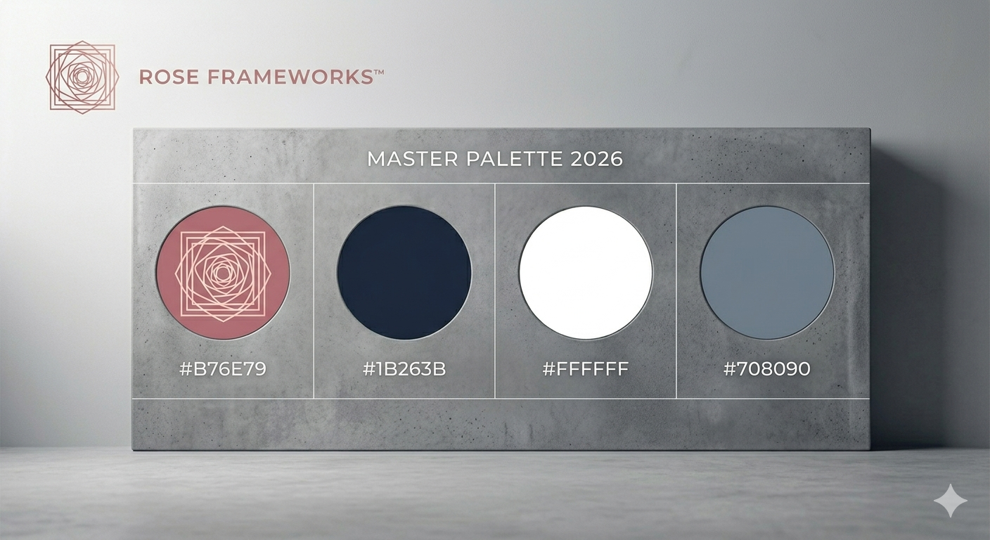

The Brand Color Blueprint codifies the structural DNA of our visual identity. By adhering to these specific values, you eliminate the “chromatic noise” that occurs when brand colors shift across platforms.
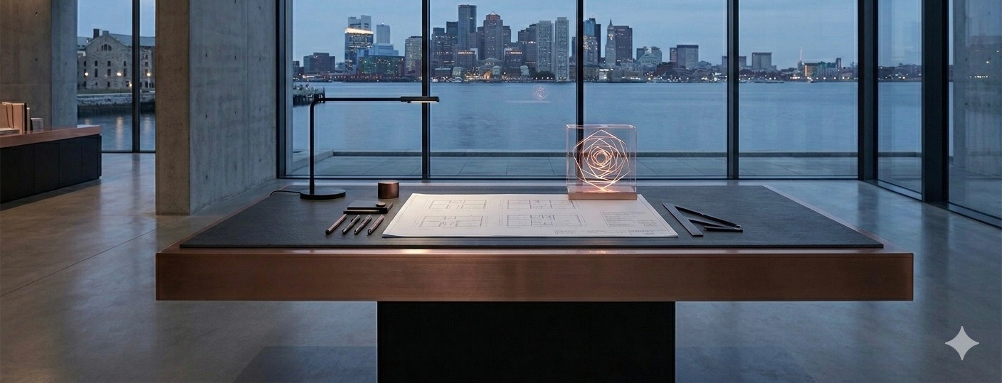
Our palette is engineered for silent luxury, balancing the weight of our foundations (grey/navy) with the kinetic energy of our innovations (rose gold).
Primary Backgrounds: Utilize Slate Grey or high-resolution concrete textures to establish a professional, load-bearing field.
Typography: Use Navy Blue for body copy to ensure maximum legibility and authority.
Call-to-Action (CTA): Reserve Rose Gold exclusively for buttons or links that drive Creative Velocity. Its vibrancy should be used sparingly as a high-impact "flourish."
Consistency is the bedrock of authority. When these colors are applied with precision, the brand speaks with a single, unified voice.